
[vc_row content_width=“grid“ css=“.vc_custom_1450440286512{padding-top: 65px !important;}“][vc_column offset=“vc_col-lg-offset-2 vc_col-lg-8 vc_col-md-offset-1 vc_col-md-10″][vc_column_text]
01. Timeless Design Advice; A Group of Pros
[/vc_column_text][vc_empty_space height=“35px“][vc_column_text]Museo is a clean yet unconventional semi-serif, designed by Jos Buivenga. This OpenType font family comes in five weights, and each weight comes with support for CE languages, even Esperanto. Besides ligatures, contextual alternatives, stylistic alternates, fractions and proportional/tabular figures, Museo has a “case” feature for case-sensitive forms. The sans-serif version is a sturdy, low-contrast, geometric, highly legible sans-serif typeface that is well suited to any display and text use. Both typefaces are lucid and versatile, great for cool-looking headlines but also effective as medium-sized text. Bonus: some weights of Museo are available for free downloading: Museo Free Download, Museo Sans Free Download.[/vc_column_text][vc_empty_space height=“25px“][vc_column_text]Gotham is new, economical and designed specifically for text. The typeface can be used in publications, on websites, for branding and on book covers and posters. The typeface includes four different widths, from regular to condensed, and each style is paired with a matching italic. For tables and charts, Gotham’s core styles include a “Numeric” range that contains tabular figures, fractions and extended symbols.[/vc_column_text][vc_empty_space height=“25px“][vc_column_text]With Metroscript, New York-based lettering artist Michael Doret has adapted his trademark hand-lettering style to the computer, creating one of the most sophisticated suites of script fonts on the market. Metroscript was successful throughout 2008 and proudly holds the title of MyFonts’ Brush Script Font of the Year. Designed by Eric Olson in 2002/2003, Locator was originally proposed as a custom typeface for the Design Institute at the University of Minnesota. Locator is now a complete family of 12 fonts with true italic. Since its release in the spring of 2003, Locator has been used for a range of projects, including[/vc_column_text][/vc_column][/vc_row][vc_row content_width=“grid“ css=“.vc_custom_1450167880231{padding-top: 75px !important;padding-bottom: 75px !important;}“][vc_column][vc_single_image image=“159″ img_size=“full“][/vc_column][/vc_row][vc_row content_width=“grid“][vc_column offset=“vc_col-lg-offset-2 vc_col-lg-8 vc_col-md-offset-1 vc_col-md-10″][vc_column_text]
02. Personal Work that You’re Passionate About
[/vc_column_text][vc_empty_space height=“35px“][vc_column_text]Museo is a clean yet unconventional semi-serif, designed by Jos Buivenga. This OpenType font family comes in five weights, and each weight comes with support for CE languages, even Esperanto. Besides ligatures, contextual alternatives, stylistic alternates, fractions and proportional/tabular figures, Museo has a “case” feature for case-sensitive forms. The sans-serif version is a sturdy, low-contrast, geometric, highly legible sans-serif typeface that is well suited to any display and text use. Both typefaces are lucid and versatile, great for cool-looking headlines but also effective as medium-sized text. Bonus: some weights of Museo are available for free downloading: Museo Free Download, Museo Sans Free Download.[/vc_column_text][vc_empty_space height=“25px“][vc_column_text]Gotham is new, economical and designed specifically for text. The typeface can be used in publications, on websites, for branding and on book covers and posters. The typeface includes four different widths, from regular to condensed, and each style is paired with a matching italic. For tables and charts, Gotham’s core styles include a “Numeric” range that contains tabular figures, fractions and extended symbols. For tables and charts, Gotham’s core styles include a “Numeric” range that contains tabular figures, fractions and extended symbols.[/vc_column_text][/vc_column][/vc_row][vc_row content_width=“grid“ css=“.vc_custom_1450167692008{padding-top: 70px !important;padding-bottom: 65px !important;}“][vc_column][eltd_blockquote text=“Vision dominates a lot of our subconscious interpretation of the world around us. On top of that, pleasing images create a better user experience partly because we perceive attractive objects as working better. When it comes to design, perception is reality.“][/vc_column][/vc_row][vc_row content_width=“grid“][vc_column offset=“vc_col-lg-offset-2 vc_col-lg-8 vc_col-md-offset-1 vc_col-md-10″][vc_column_text]With Metroscript, New York-based lettering artist Michael Doret has adapted his trademark hand-lettering style to the computer, creating one of the most sophisticated suites of script fonts on the market. Metroscript was successful throughout 2008 and proudly holds the title of MyFonts’ Brush Script Font of the Year. Designed by Eric Olson in 2002/2003, Locator was originally proposed as a custom typeface for the Design Institute at the University of Minnesota. Locator is now a complete family of 12 fonts with true italic. Since its release in the spring of 2003, Locator has been used for a range of projects, including books, signage, corporate identity and even the company’s website.[/vc_column_text][/vc_column][/vc_row][vc_row content_width=“grid“ css=“.vc_custom_1450271784533{padding-top: 75px !important;padding-bottom: 75px !important;}“][vc_column][vc_single_image image=“160″ img_size=“full“ alignment=“center“][/vc_column][/vc_row][vc_row content_width=“grid“][vc_column offset=“vc_col-lg-offset-2 vc_col-lg-8 vc_col-md-offset-1 vc_col-md-10″][vc_column_text]
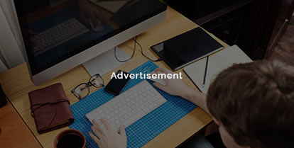
03. Mingling with other designer colleagues
[/vc_column_text][vc_empty_space height=“35px“][vc_column_text]Museo is a clean yet unconventional semi-serif, designed by Jos Buivenga. This OpenType font family comes in five weights, and each weight comes with support for CE languages, even Esperanto. Besides ligatures, contextual alternatives, stylistic alternates, fractions and proportional/tabular figures, Museo has a “case” feature for case-sensitive forms. The sans-serif version is a sturdy, low-contrast, geometric, highly legible sans-serif typeface that is well suited to any display and text use. Both typefaces are lucid and versatile, great for cool-looking headlines but also effective as medium-sized text. Bonus: some weights of Museo are available for free downloading: Museo Free Download, Museo Sans Free Download.[/vc_column_text][vc_empty_space height=“25px“][vc_column_text]Gotham is new, economical and designed specifically for text. The typeface can be used in publications, on websites, for branding and on book covers and posters. The typeface includes four different widths, from regular to condensed, and each style is paired with a matching italic. For tables and charts, Gotham’s core styles include a “Numeric” range that contains tabular figures, fractions and extended symbols.[/vc_column_text][vc_empty_space height=“25px“][vc_column_text]With Metroscript, New York-based lettering artist Michael Doret has adapted his trademark hand-lettering style to the computer, creating one of the most sophisticated suites of script fonts on the market. Metroscript was successful throughout 2008 and proudly holds the title of MyFonts’ Brush Script Font of the Year. Designed by Eric Olson in 2002/2003, Locator was originally proposed as a custom typeface for the Design Institute at the University of Minnesota. Locator is now a complete family of 12 fonts with true italic. Since its release in the spring of 2003, Locator has been used for a range of projects, including[/vc_column_text][/vc_column][/vc_row]

The typeface includes four different widths, from regular to condensed, and each style is paired with a matching italic. For tables and charts, Gotham’s core styles include a “Numeric” range that contains tabular figures, fractions and extended symbols.
This OpenType font family comes in five weights, and each weight comes with support for CE languages, even Esperanto. Besides ligatures, contextual alternatives, stylistic alternates. Museo is a clean yet unconventional semi-serif, designed by Jos Buivenga.
The typeface includes four different widths, from regular to condensed, and each style is paired with a matching italic. For tables and charts, Gotham’s core styles include a “Numeric” range that contains tabular figures, fractions and extended symbols.